SCREEN ANGLES OF ROTATION
Here is another twist…
Andrey Makarevich
In ancient times, when the trees were large, the grass was greener, and vodka tasted better, screening also was there. But it was not such as today, digital screening. It was analog, photomechanical. And it was being made by serious men and women in special gowns on special reproduction cameras, so large that sometimes they did not fit in one room. And those men and women were the great masters of screening something. They could magic up halftone negatives behind zonal color filters, or concoct two-step masking, with compensating masks, of course, and even venture the projection screening. And this is not counting other small pranks, like contact screening. Also they really liked to stir various masquerades – masking both with “grey” and color masks, and they had a gazillion of various kinds of gradation masks.
Everything seemed to be well, but moiré got into the habit to appear, a phenomenon of nature, but it was rather harmful. Once they conceive to print a beautiful colorful picture, they divide the image into the primary colors, obtain color-separated halftone films, lay down them together, and then despicable “moiré” is right there. That thug spoils the picture and makes them weep.
Moiré gave a hard time to all, and serious men and women decided to ruin it. They thought for a long time, covered with writing three cartloads of paper, defended 333 dissertations, and finally came up with the idea.
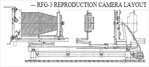
They put the round glass screens with applied edging degree scale just in front of the light-sensitive photographic material and started producing every color-separated screen negative under its own special angle, and not anyhow taken, but specifically defined for each ink. The rules of setting the angles were written on the paper, and it was agreed to make the color separations in the future only according to the rules, so that moiré did not spoil the color images. However, they still failed to ruin the moiré. Once the rules written are not observed, the moiré appears again on the color images and spoils them.
It’s been a while since then. There are no projection reproduction cameras, there are no projection and contact screens, but the term “screen angle of rotation” is still in use. However, sometimes some irresponsible comrades say “the angle of inclination” instead of “the angle of rotation”, but this is not out of wickedness, that’s only because they do not know the fairy tale.
TALE OF SENSE, IF NOT OF TRUTH…
Moiré - is a macro-periodic structure resulting from the interference between two or more periodic structures. Indeed, moiré cannot be fully eliminated when periodic screen-type patterns are applied. However, it is really possible to minimize this phenomenon by optimally selecting the screen angles of rotation.
TERMINOLOGY
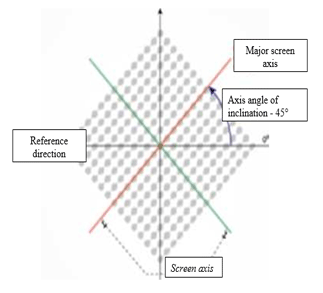
Angle of rotation – is the angle between the screen axis and the zero axis of the coordinate system, basically, this is an angle between the reference direction and the main screen axis for the selected separation.
The terms “angle of rotation” and “angle of inclination” are equally correct to use, and at the moment the term “screen angle of rotation” is more understandable to a specialist not tutored in the historical aspects.
From the point of view of understanding the structure and principles of construction of the bitmaps, in addition to the term “angle of rotation”, there are some important concepts:
Reticle axis – is the line along which the screen has the greatest number of elements – dots per length unit. For a linear screen, the axis coincides with the direction of the lines of the screen elements.
The major, or basic screen axis – in the case of asymmetrical screen elements – is the screen axis coinciding with the direction of the largest diameter of the elliptical dot or of the greatest length of the rhombic screen dot. Symmetrical screen dots (round or square) have no major axis.
Reference direction - is the horizontal direction at a normal viewing of the printing plate from the exposure device jaw, actually, the direction parallel to the exposure device jaw.
SCREEN-TYPE PATTERN ELEMENTS
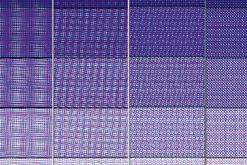
Halftone rosette – is the minimum interference cell (object) at overlapping the screen separations.
Polygraphic, or halftone rosette is formed due to overlapping of color separations. In the classic case, at four-color synthesis, by overlapping of four bitmaps.
The visible low-frequency periodic structures significantly impair the visual perception of the images, and the frequency of the formed moiré depends on the angle of rotation of the separations forming the image.

THE PHYSICAL ESSENCE OF MOIRÉ
Moiré occurs at overlapping of the periodic screen-type patterns, and these results in obtaining another periodic structure. The resulting structure has a period different from the periods of the structures composing thereof, and, unfortunately, not to the lower value. In fact, there is moiré in the printed image obtained with the use of autotypical synthesis, always with a greater or lesser degree of visibility. Moiré can be both clearly visible and virtually invisible, depending on the number of parameters of screening and reproducible image characteristics.
Below, we will consider only inter-separation moiré, though other types of moiré are observed in nature:
HARDWARE MOIRÉ
arising from the interaction of the screen-type patterns with periodic array elements or laser printing heads
OBJECTIVE, OR PATTERN MOIRÉ
appears when screening the fabrics or other texture objects having a regular formation or regular fabric pattern (thin stripes or checks), lace, hatching, etc.
INTER-SEPARATION MOIRÉ
appears when screening the fabrics or other texture objects having a regular formation or regular fabric pattern (thin stripes or checks), lace, hatching, etc.
PRINTED MOIRÉ
resulting from splitting or doubling at printing
For visual perception of great importance is the frequency, or the period of moiré structure. If the value of its frequency is about 20-40 lines per centimeter or more, the probability of distinguishing it at printing is low. If the moiré frequency is low and is less than 10 lines per centimeter, moiré will be clearly visible at printing.
Why there is moiré at combining periodic structures with equal spatial frequencies while turning a separation at a certain angle?
The fact is that the rotation of one of the separations results in a relative increase in the separation spatial frequency in the direction of the major axis of the other separation. The value of increment of the second separation projection frequency to the major separation axis will be the spatial frequency of the resulting moiré.
At small screen angles of rotation, the lineature of the interference structure, the moiré, also has a low value and is clearly visible.
SELECTION CRITERIA
SELECTION OR DETERMINATION OF ANGLES OF ROTATION IS PERFORMED BY SEVERAL CRITERIA
In order to choose the right screen angle of rotation, first, it is necessary to determine the coordinate system and the starting point of measuring the angle. And it is not all univocal in the printing industry. There are two systems of determining the angles of inclination of the screen-type patterns used in modern raster processors.

In the first case, the starting point is on the axis of ordinates, and the screen angle of rotation for the ink is determined by the angle between the major screen axis and the axis of ordinates in the clockwise direction.
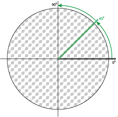
In the second case, the angle of rotation is determined as the angle between the major screen axis and the axis of abscissas counterclockwise.
Basically, the coordinate system is not critical for selection of the angles of rotation. The only thing that is important is the ratio or the difference between the angles of the screen-type patterns which are finally obtained.
For different kinds of screens, the intervals of permissible values of angles of rotation are also different.
The greater the angle of rotation between the separations, the higher the frequency of the resulting moiré. Of course, the best option in terms of minimizing moiré is a rotation of 45 degrees, but there are only two options of placement with the different of 15 degrees.
- 0º-90º
- 45º-135º
And what to do with two more separations?
Rotation of 30 degrees – is also barely noticeable visually and technologically suitable for printing, and there are more options of placement – three, for example:
- 0º-90º
- 30º-120º
- 60º-150º
But all the same, the angle is not sufficient for one separation (ink)
The difference in the angles of rotation of 15 degrees in some printing conditions leads to the formation of the well distinguishable moiré, so applying the angles that differ by15 degrees is highly undesirable.
- 0º-90º
- 15º-105º
- 30º-120º
- 45º-135º
- 60º-150º
- 75º-135º
There are four separations (inks) required for triadic printing. Thus, using the different of 15 degrees is inevitable, and one of the separations will be necessarily at the moiré angle to the other two. This is usually a yellow ink, it is “blind” (not contrasting), thus, the moiré structure formed with this ink is the least noticeable.
THEORETICALLY, MOIRÉ SHOULD BE COMPLETELY ABSENT AT A ZERO ANGLE OF ROTATION OF THE SCREENS RELATIVE TO EACH OTHER. HOWEVER, THIS IS ONLY TRUE FOR PERFECTLY ALIGNED SEPARATIONS. IN PRACTICE, IT IS IMPOSSIBLE TO PERFORM SUCH PRINTING MODE. EVEN A MINIMUM MISALIGNMENT OF INKS AT PRINTING WOULD GENERATE LOW-FREQUENCY (LARGE) MOIRÉ.
STANDARD ANGLES
The ISO 12647-2 standard of offset printing describes the principle based on which it is recommended to set the screen angles of rotation. The angle of rotation must be determined for each ink or color separation. Of course, non-periodic screen-type patterns do not have the angles of inclination.
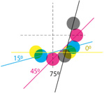
According to ISO 12647-2, in the case of biaxial periodic screens, i.e. with round or square dot, the difference between the screen angles of rotation of the cyan, magenta and black inks should be 30°, and the angle of inclination of the yellow ink should differ by 15° from the other two. The screen angle of rotation of the ink dominant in the image should be 45°

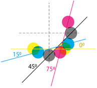
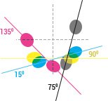
In case of using the screens having a major axis (with oval or rhombic dot), there should be 60 degrees between the angles of rotation of the major axes of the cyan, magenta and black inks, and the angle of rotation of the yellow ink should be different by 15°. The dominant ink angle of inclination is 45° or 135°
THE DOMINANT INK
SHOULD BE PUT AT AN ANGLE OF 45 DEGREES. THREE OPTIONS ARE POSSIBLE HERE.

By the way, do you know why it is 45 degrees? It’s all about an interesting phenomenon of spatial vision, which is called the tilt effect. It lies in that at perception of the bitmap objects oriented at an angle of 0° and 90° (relative to the line connecting the eyes), the visual acuity is higher than at perception of the rectangular screens oriented at an angle of 45°.
Therefore, the rectangular screens of the dominant color are printed out at an angle of 45°.
SO, FINALLY, FOR THE MOST POPULAR BIAXIAL SCREENS HAVING THE MAJOR AXIS, I. E. FOR ELLIPTIC SCREENS, PRACTICAL RECOMMENDATIONS FOR SETTING THE ANGLES OF ROTATION FOR SEPARATIONS ARE AS FOLLOWS
HOW TO EVALUATE THE INTER-SEPARATION MOIRÉ BEFORE PRINTING?
The possible options of the screen separations angles of rotation are limited not only by technological features of minimizing moiré, but also by the existing library of screen sets (specified in the screening settings options of the screening program). And it should be regarded that even in the standard screen sets there may “rotten apples”, thus, one should first check the selected screen set for the presence of moiré.
THERE ARE SEVERAL WAYS OF VISUAL ASSESSMENT
PRINTING TEST
The most reliable, but also the most expensive way.
ANALOGUE COLOR PROOF
In fact, it is not relevant at the moment
PHOTOTECHNICAL
It is based on post-separation combination of the films. Of course, if you print the films by the CtF technology, which at the moment is not actually relevant.
SCREEN BITMAP COLOR PROOF
The screen bitmap color proof is the cheapest way, and according to practice, it is as reliable as the test print.
Many raster processors support printing of the bitmapped images on the monitor for verification. It is those bitmapped images that can be used for evaluation of the images for the presence of moiré.
But in order to evaluate the possibility of moiré on the monitor, the hardware moiré of the monitor screen must be excluded, and it appears when combining the halftone dot structure and the periodic cellular structure of the monitor screen. To do this, the image must be displayed on the monitor with such magnification that the halftone dot is reproduced with the same number of pixels as on the film recorder. However, this is not always possible, therefore, the half the number of dots can be used. If the halftone dot structure is visible at viewing, it is necessary to increase the viewing distance. Thus, the most critical colors are evaluated for the presence of inter-separation moiré.
TECHNIQUES OF SCREEN-TYPE PATTERN VISIBILITY REDUCTION
Formation of the halftone rosette structure, or rosettes, significantly affects visual perception of the image. Very often, it is the formation of the rosette structure on the informationally critical areas of the image that leads to groundless claims of clients.
INCREASE OF PRINTOUT LINEATURE
The most intuitive method of reducing distinctiveness is to increase the lineature during screening. Indeed, increasing the lineature results in decrease of the halftone rosette, but for example, as calculations show, the lineature increase from 150 to 175 lines per inch results in reduction of the rosette only by 11 percent, so this method is not very productive. And given the challenges posed by increasing the lineature at printing and loss of gradation, it is generally undesirable.
APPLICATION OF SCREENING WITH THE SCREEN OFFSET FREQUENCY
More effective methods are the techniques based on the destruction of the rosette structure. For example, changing the frequencies of the individual separations. But it requires caution and thorough check before industrial use. Many raster processors suggest ready screen sets with the changed separation frequencies selected exactly with a view to reduce the rosette structure in the image.
SELECTION OF THE COLOR SYNTHESIS METHOD
The visual size of the rosette is different for different colors and depends on the CMYK-coordinates of the displayed color.
Let us consider the influence of the CMYK-formula on the rosette formation.
The figure shows the three types of the rosettes formed as a result of applying the “classic” screen angles of rotation for the three options.


1 - halftone rosette formed with two inks


2 - halftone rosette formed with three inks
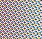

3 - halftone rosette composed of four inks
As it is vividly seen in the given figures, the more color contour paints (CCP) are involved in the formation of the halftone rosette, the greater is its size. Consequently, it is necessary to choose the color separation methods, so that the colors formed at the color synthesis, especially in halftones, had optimal formula for the screen-type pattern. For example, GCR with the late start of the black ink.
APPLICATION OF STOCHASTIC SCREENING
It is definitely possible to completely eliminate the inter-separation moiré, but by other methods.
One of the most promising methods that allows to completely eliminate the formation of the interference structures is the use of stochastic screening. No periodic structure means no moiré. Currently, there is an active standardization of printing with the use of stochastic screens, so in the next 3-5 years, stochastics will be widely used in industrial printing, both in sheet and web printing.
APPLICATION OF THE COMBINED SCREENING
Application of the combined screening (not to be confused with the hybrid). The combined screening is the use of different types of screens for screening of various colorful separations.
To reduce the halftone rosette, the black ink can be derived by stochastics, and the cyan, magenta and yellow – with the round or elliptical dot with angles of rotation of 15°, 45° and 75° respectively.
In this scheme, the size of the halftone rosette is almost equal to the lineature, and, therefore, it is visually indistinguishable under normal viewing conditions
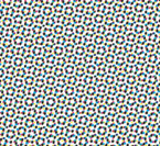

CLASSIC ELLIPTIC SCREEN
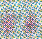
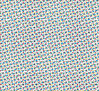
COMBINED SCREENING
This screening method is completely fits the print standard in color, and it does not require special profiling of the process. One needs only to compensate the tone curve for the black ink.
Currently, the technique of combined screening on the existing raster processors is worked out in detail in the printing house of the Polygraphic Complex «Pushkinskaya Ploshchad» and it is applied very successfully at printing of a number of editions.
